
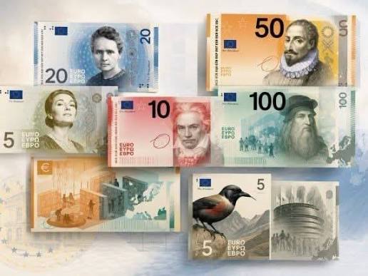
The European Central Bank is preparing to redesign the Euro banknotes, and for the first time, the public gets a say in what our future currency will look like.
The ECB has shortlisted 10 visual sets spanning two distinct design themes: “Birds and Rivers” (focusing on natural landscapes and wildlife) and “European Culture” (focusing on shared human history, art, and prominent historical figures like Leonardo da Vinci and Beethoven).
While online opinion seems heavily swayed toward the colorful “Birds and Rivers” series, there’s a deeper question we need to ask: Which design actually looks and feels European?
Here is a breakdown of the new proposed shortlisted Euro banknotes and why the cultural design theme deserves a closer look.
The “Birds & Rivers” Series: Beautiful, But Do They Fit Europe?
If you look at the early feedback across social media and numismatic forums, the “Birds and Rivers” design set is winning over many collectors at first glance.
Pros:
- Vibrant Artistry: The notes are undeniably full of life, featuring rich colors and detailed illustrations of European fauna and waterways.
- Modern Aesthetic: They present a clean, nature-focused look that aligns with environmental awareness.
The Catch:
While the artistry is impressive, these designs arguably lack a distinct European identity. The style and layout feel much closer to modern Australian banknotes or various East Asian currencies than traditional European money. They are pretty pictures, but do they capture the essence of Europe?
When people around the world think of Europe, they rarely default to wild riverbeds and bird species. They think of history, architecture, art, global achievements, and culture. —
The “European Culture” Series: True to European Identity
The “European Culture” concept (particularly Design Option G) takes a very different approach. While some critics initially call these designs “stark” or “dull” compared to the bright wildlife notes, they possess something far more important for circulating currency: authenticity.
Why Option G Stands Out:
- Instantly Identifiable as European: The fonts, historical portrait styles, and architectural elements feel deeply rooted in European history.
- The Vertical Portrait Layout: Option G introduces a striking vertical portrait layout that modernised the look while retaining classic numismatic heritage.
- Familiarity Meets Innovation: Great currency design strikes a balance between feeling completely brand new while remaining instantly recognisable. Option G feels familiar to current Euro notes, maintaining that vital visual link to European heritage, while offering a fresh, modern aesthetic.
Currency isn’t just about putting the prettiest illustration on a piece of paper; it’s about reflecting the identity, history, and soul of the region it represents. For a continent defined by its museums, landmarks, and historic milestones, the European Culture theme is the more natural fit.
Which Euro Banknote Design Should You Vote For?
The choice ultimately comes down to what you believe currency should represent:
- Vote “Birds & Rivers” if you prioritize modern, vibrant nature artwork.
- Vote “European Culture” if you prefer a design that honours Europe’s rich history, art, and iconic heritage.
- Have your say here: https://www.ecb.europa.eu/euro/banknotes/future_banknotes/html/design-proposals.en.html
Which set do you prefer? Are you voting for the nature-inspired notes or sticking with European culture and history? Let us know your thoughts in the comments below!